Managing control titles
User interface elements often need a title or label to identify their purpose, with the title placed near the
element it identifies. As shown by examples in Automatic layout, you can use a statictext
element as a title or label, and use the automatic layout mechanism to control the placement of such a title
relative to the element it identifies.
The title-layout mechanism provides a simpler way to accomplish this task for many common cases. It
allows you to define an element’s title and its spacial relationship with the graphic representation of the
object it identifies, without the need for additional statictext and container elements. Title layout
operates on an element’s optional title and titleLayout properties.
It treats this title and the element’s graphic representation as two separate objects whose relative positions
are controlled according to layout rules within a virtual container that encloses both objects. This is
similar to the operation of the automatic layout mechanism, but within a more limited scope.
Title layout is available for these types of UI elements: - dropdownlist - flashplayer - IconButton - Image - tabbedpanel
For most of these element types, the title typically appears outside the element itself, and the virtual container is an imaginary line surrounding the title and the separate element. For the IconButton, the title appears inside the bounds of the button, and the virtual container is defined by the outer bounds of the element. The same principles apply in both cases.
The title property is a String that defines a text label for a UI element. The title can appear to the left or right of the graphic element, above or below it, or superimposed over the center of the graphic element; the placement is controlled by the titleLayout property.
The titleLayout property is an Object containing properties that specify:
The title’s character width;
The title’s justification within the character width;
How the title should be truncated if necessary;
The orientation, alignment, and spacing of the title with respect to the object it identifies;
The margins within the virtual container that surrounds the title and its related object.
All titleLayout properties are optional; the element types that use this mechanism have default values
for each property. Complete details are provided in the reference section; see titleLayout.
The following sections provide examples that show how to use title layout to achieve many different layouts.
Title alignment and orientation
Unlike automatic layout, title layout uses the alignment property to specify the orientation of the title and
graphic element, and how the title aligns to the graphic element. This property contains a 2-element array,
where the first element specifies horizontal alignment and the second specifies vertical alignment. The
allowed values for these are the same as those used by automatic layout (see Aligning children),
except that the fill value is not allowed.
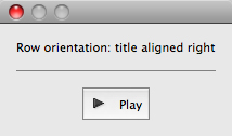
To achieve a row orientation where the title appears to the left or right of the graphic element, define horizontal alignment as left or right and vertical alignment as
center,top, orbottom:button.titleLayout = { alignment: ['right', 'center'] };
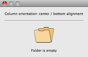
To achieve a column orientation where the title appears above or below the graphic element, define vertical alignment as
toporbottom, and horizontal alignment ascenter:image.titleLayout = { alignment: ['center', 'bottom'] };
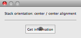
To achieve a stack orientation where the title appears superimposed upon the graphic element, define both vertical and horizontal alignment as
center. This orientation is mainly useful with theiconbuttonorimageelement types; it does not make sense to superimpose a title over a dropdownlist, for instance. In this example, the button’s title is centered over its iconic image:button.title = 'Get information'; button.titleLayout = { alignment: ['center', 'center'] };
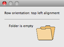
With row orientation, you can control whether the title aligns to the top, center, or bottom of the graphic element. In this example, the title is placed to the left of the image, aligned at the top edge:
image.titleLayout = { alignment: ['left', 'top'] };
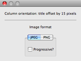
Use
spacingto override the default number of pixels separating the title from the graphic element. In this example, titleLayout is configured to place the title 15 pixels above the panel:panel.title = 'Image format'; panel.titleLayout = { alignment: ['center', 'top'], spacing: 15 };
Title character width and justification
To override the automatically calculated title width, define a positive non-zero value for the
charactersproperty. This reserves enough space in the title area to hold the specified number of “X” characters. This is useful when an element’s title can change (for localized values, for instance) and you want to reserve enough space to fit all the expected values without truncation or affecting the overall layout.droplist.titleLayout = { alignment: ['left', 'center'], characters: 20 };
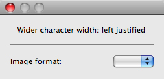
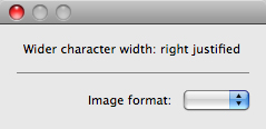
When a
charactersvalue specifies a width greater than the default title width, you can set thejustifyproperty to control how the text of the title is justified within the space reserved for it. The valueleftplaces the text at the left end of the space, leaving blank space on the right;rightplaces the text at the right end of the space, leaving blank space on the left; andcenterplaces the text in the middle of the space, dividing any blank space evenly on both sides of the text.droplist.titleLayout = { alignment: ['left', 'center'], characters: 20, justify: 'right' };
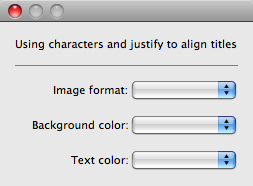
This example demonstrates using
charactersandjustifyto vertically align the colons at the ends of all the dropdownlist control titles in a group. The samecharactersvalue is used for each element’stitle, and all are right-justified:w.ddl1 = w.add("dropdownlist { title: 'Image format:' }"); w.ddl2 = w.add("dropdownlist { title: 'Background color:' }"); w.ddl3 = w.add("dropdownlist { title: 'Text color:' }"); w.ddl1.titleLayout = { alignment: ['left', 'center'], spacing: 3, characters: 16, justify: 'right' }; w.ddl2.titleLayout = { alignment: ['left', 'center'], spacing: 3, characters: 16, justify: 'right' }; w.ddl3.titleLayout = { alignment: ['left', 'center'], spacing: 3, characters: 16, justify: 'right' };
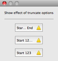
Title truncation
If the space reserved for a title is not wide enough to display its entire text, set the truncate property to
control the appearance of the truncated text. If truncate is middle, characters are removed from the
middle of the text and replaced with an ellipsis (…). For the value end, characters are removed from the
end of the text and replaced with an ellipsis. If truncate is none or is not defined, characters are removed
from the end, without any replacement ellipsis character.
This example demonstrates the effect of all three options on the same title string:
w.btn1 = w.add("iconbutton { title: 'Start 123456 End', image: 'SystemWarningIcon' }");
w.btn2 = w.add("iconbutton { title: 'Start 123456 End', image: 'SystemWarningIcon' }");
w.btn3 = w.add("iconbutton { title: 'Start 123456 End', image: 'SystemWarningIcon' }");
w.btn1.titleLayout = { characters: 8, truncate: 'middle' };
w.btn2.titleLayout = { characters: 8, truncate: 'end' };
w.btn3.titleLayout = { characters: 8, truncate: 'none' };
Margins around the title and graphic object
The margins property specifies the number of pixels separating each edge of an element from the visible
content within that element. This value overrides the default margin settings (no margins for most
element types, 6 pixels at each edge for iconbutton).
For
iconbutton, the margins value controls the padding between the button’s frame and its title and icon image.For other element types,
marginscontrols the padding between the imaginary border surrounding the union of the bounding boxes of the title and graphic object, which makes the space occupied by an element larger than its default measurements.
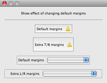
This example demonstrates overriding the default margins for iconbutton and dropdownlist elements.
The lists are enclosed in panels to create artificial borders around them:
w.btn1 = w.add("iconbutton { title: 'Default margins', image: 'SystemWarningIcon' }");

w.btn2 = w.add("iconbutton { title: 'Extra T/B margins', image: 'SystemWarningIcon' }");
var defaultBtnMargins = w.btn2.titleLayout.margins;
w.btn2.titleLayout = { margins: [defaultBtnMargins[0], 15, defaultBtnMargins[2], 15] };

w.panel1 = w.add("panel { margins: 0, ddl1: DropDownList { title: 'Default margins' } }");
w.panel2 = w.add("panel { margins: 0, ddl2: DropDownList { title: 'Extra L/R margins' } }");
w.panel2.ddl2.titleLayout = { margins: [15, 0, 15, 0] };